
If you’re a Warhammer fan of a certain vintage, you’ll have fond memories of colours like Goblin Green, Titillating Pink, Ultramarines Blue, and Snakebite Leather. There are a few paint ranges which offer the same colour range as recreations, but in this video I want to talk about Nostalgia ’88 by Warcolours. (Affiliate link)
This is a range of colours designed to replicate the 80s range of Citadel Colour paints. They come in 20ml flip top pots that look very familiar to the original ones, and have a very similar smell and consistency to those classic paints that many of us grew up using. Warcolours also state they have a 99% colour accuracy to the original range.
Therefore these should be of interest to hobbyists who grew up with classic games like Warhammer Fantasy Battles, Rogue Trader, Space Crusade and Heroquest. If you have fond memories of sitting at the kitchen table painting small lead heroes and powerful monsters, read on…

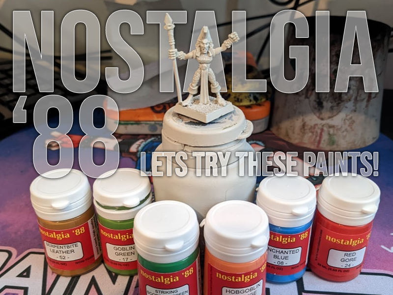
Warcolours very kindly sent me a sample set of 18 of their paints to try out, specificially the following colours:
01 – Bronzed Flesh
08 – Enchanted Blue
10 – Swamp Brown
13 – Hobgoblin Orange
17 – Goblin Green
21 – Ghoul Grey
23 – Electric Blue
24 – Red Gore
27 – Titillating Pink
39 – Salamander Green
42 – Marine Dark Blue
43 – Space Wolf Grey
44 – Blue Grey
48 – Striking Scorpion Green
51 – Ork Flesh
52 – Serpentbite Leather
54 – Hawk Turquoise
68 – Amethyst Purple
One of the things I really like is that they currently have a wide range of the paints from the era already available beyond what I’ve got to test here, and they have even recreated some of the classic paint sets of the era such as the Creature and Monster paint sets.
In order to test these paints I thought it would be very much appropriate to paint some era-appropriate models with them, so I picked out some classic 80s Wood Elves!

These guys have been around the block a few times! For the painting process for these I also streamed live on my Twitch Channel, if you’re fast you might still catch the VOD to watch me using these paints in person!


Above you can see the unit musician, snapped at the point where I’d finished applying base coats ready to be shaded. The nostalgia paints used above are Goblin Green (tunic), Salamander Green (leggings), Serpentbite Leather (boots), Gore Red (harp), Hobgoblin Orange (hair), Swamp Brown (pouches, straps), Bronzed Flesh (skin, harp strings), and Marine Dark Blue (sword grip). The metallics shown are citadel’s Leadbelcher and Screaming Bell.
Most of these colours covered very nicely with two thin coats. I was pleased with the solid and vivid colours from Gore Red and Goblin Green in particular. Serpentbite did take an extra layer to get a flat coat, with Salamanders Green requiring the most layers to build up the colour.
This is where I noticed a strong similarity to the paints these attempt to replicate – they are rather transparent even over a few thin layers. Unlike most contemporary paints you will likely not be able to paint directly over areas of another colour easily, so you will probably want to take your white paint and clean up any areas before applying the next colour.
The red notably had the same properties as the classic paint of showing any dark colours through quite obviously if not painted over a clean white base. Whilst in a modern paint this could be considered a flaw, I believe this is a deliberate choice in retaining the accuracy of these paints and their original consistency and coverage.
As with the paints of the 80s, these do work best over a white undercoat. The natural transparency makes the colours pop brightly against that base colour. I would not recommend using these over darker base coats unless you’re happy to apply a few more layers to build the colour up or want a less vibrant appearance.


Above, I applied Guilliman Flesh to the hair and skin areas from the Citadel Contrast range, and Agrax Earthshade over all the other areas. The shade did flow nicely over the Nostalgia paints, retaining much of the brightness of the colours. As you can see above this simple technique gives you a pleasing effect that would be perfectly acceptable for gaming with.


And here you can see the full group of 5 miniatures. I re-highlighted with the base colours for each of the areas, then mixed in lighter shades such as hobgoblin orange into the red to highlight. Some of the top highlights were done with citadel colours where I wanted a more specific look. Overall I was impressed by the brightness and accuracy of the Warcolour collection.
Of course, Newer painters without the nostalgia are likely to wonder what the fuss is aboute, given the convenience and coverage of paints such as the Citadel base paints or Vallejo’s Game Colour paints. But for folks like me who have very fond memories of those classic colours, the nostalgia ’88 paints are very much worth a look at if you’re missing the feels and smells of those bygone years!
And for fun, here’s a more modern (as in, mid-2000s… practically yesterday!) Wood Elf Spellsinger which I painted again using mostly these Warcolours paints…


On this model I did a little blending with the warcolours paints, such as the Hawk Turquoise of the spite being mixed in with a little swamp brown to aid the transition between colours and to create various shades of grey for the staff which was base-coated in Ghoul Grey. The colours mixed well. You may recall paint mixing was very common in these early days before the Citadel Colour range had 300+ colours!
In all, I can say I was impressed with the range in that it really achieves what it sets out to do. Everything about them feels like using those paints from childhood, for better and for worse. If you’re after that nostalgic kick and want to recreate that experience of painting with the old paints – especially for those working on Oldhammer armies like myself – they’re definitely worth your time.
Newer hobbyists used to the properties of more recent paint ranges are likely to be somewhat befuddled by them though. But then, that’s literally in the name of the product. Nostalgia ’88 – if you have the nostaglia, go for them! If you don’t, well, I guess we’re spoiled for choice these days for fantastic paint ranges so use what you’re happiest with!
Summary:
Focussing on accurately replicating the paints of the 80s, these paints succeed at what they are designed for. They bring the good, and the bad, of the era back to your painting desk. Give them a go and you’ll enjoy them – as long as you have the nostalgia!


